Adding iOS Dynamic Type Support to Better
11th April, 2017 —
When Nivi pointed out on Twitter that Better didn’t have Dynamic Type support, it went to the top of my fix list.
“Just downloaded @betterbyindie. Would be great if it supported Dynamic Type so I can read updates inside the app #accessibility #a11y”
Dynamic Type is pretty cool. You can go to Settings > General > Accessibility > Larger Text on your phone, and either grow or shrink your preferred reading size. Apple will then apply this reading size to every Dynamic Type-supported element across iOS. It’s a little bit like the default or minimum font size setting in a web browser.
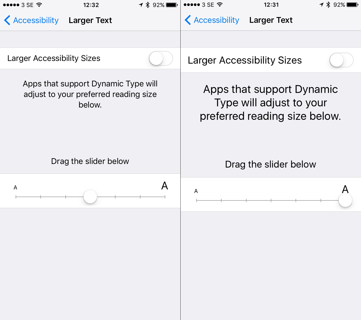
(Left: standard Settings. Right: Larger Dynamic Type.) Dynamic Type is known as “Larger Text” in the Accessibility menu. You can instantly see the text resize in the Settings. You can also enable “Larger Accessibility Sizes” to make the text even bigger.
What’s even cooler is that Dynamic Type also works in Safari on iOS.
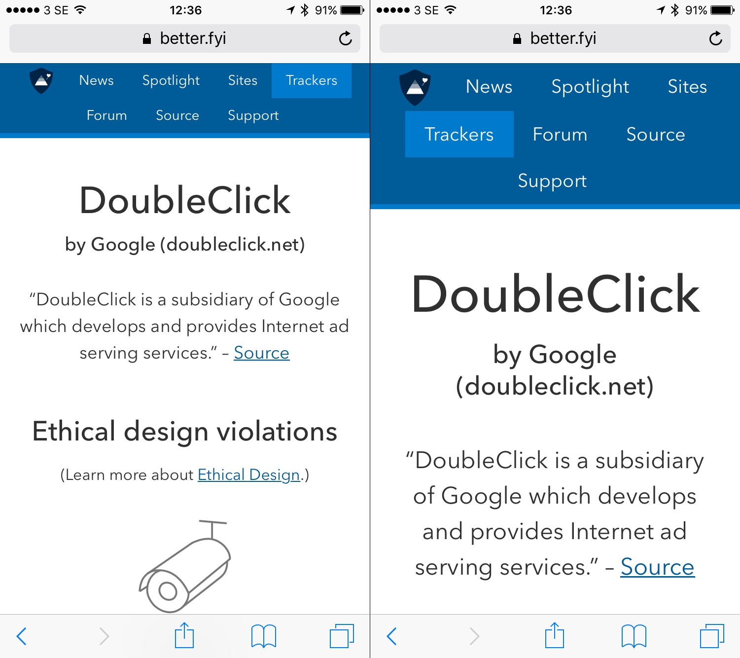
Left: the Google DoubleClick tracker page on Better.fyi without Dynamic Type enabled. Right: the same page but with a larger text size selected
As I’ve mentioned before, Better’s interface is mostly web views. They’re local to the device, but they’re HTML and CSS like you’d find on any web page. So Dynamic Text support needed to be added to the CSS.
As we have a few specific CSS rules for the app, I could have just added the Dynamic Type support there. But Dynamic Type also works in Safari, I thought it was worth making it work on the Better site as well. Apple themselves don’t seem to have support for Dynamic Type on their site, so I assume they intended this feature to mostly be used in web views inside native apps.
Adding basic Dynamic Type support
Reading up on what little “official” information there is about implementing Dynamic Text on the web, it looked to be fairly straight-forward to implement:
font: -apple-system-body
font: -apple-system-headline
font: -apple-system-subheadline
font: -apple-system-caption1
font: -apple-system-caption2
font: -apple-system-footnote
font: -apple-system-short-body
font: -apple-system-short-headline
font: -apple-system-short-subheadline
font: -apple-system-short-caption1
font: -apple-system-short-footnote
font: -apple-system-tall-body
But there are some caveats. Firstly, you need to understand what -apple-system-etc does. It is a font keyword that sets:
font-family: (system font);
font-size: (Dynamic Type size);
font-style: normal;
font-weight: (bold for -headlines, normal for -body,-caption,-footnote);
font-variant: normal;
You can see the Dynamic Type defaults in action if you visit this sample page on iOS Safari. (See screenshot below)
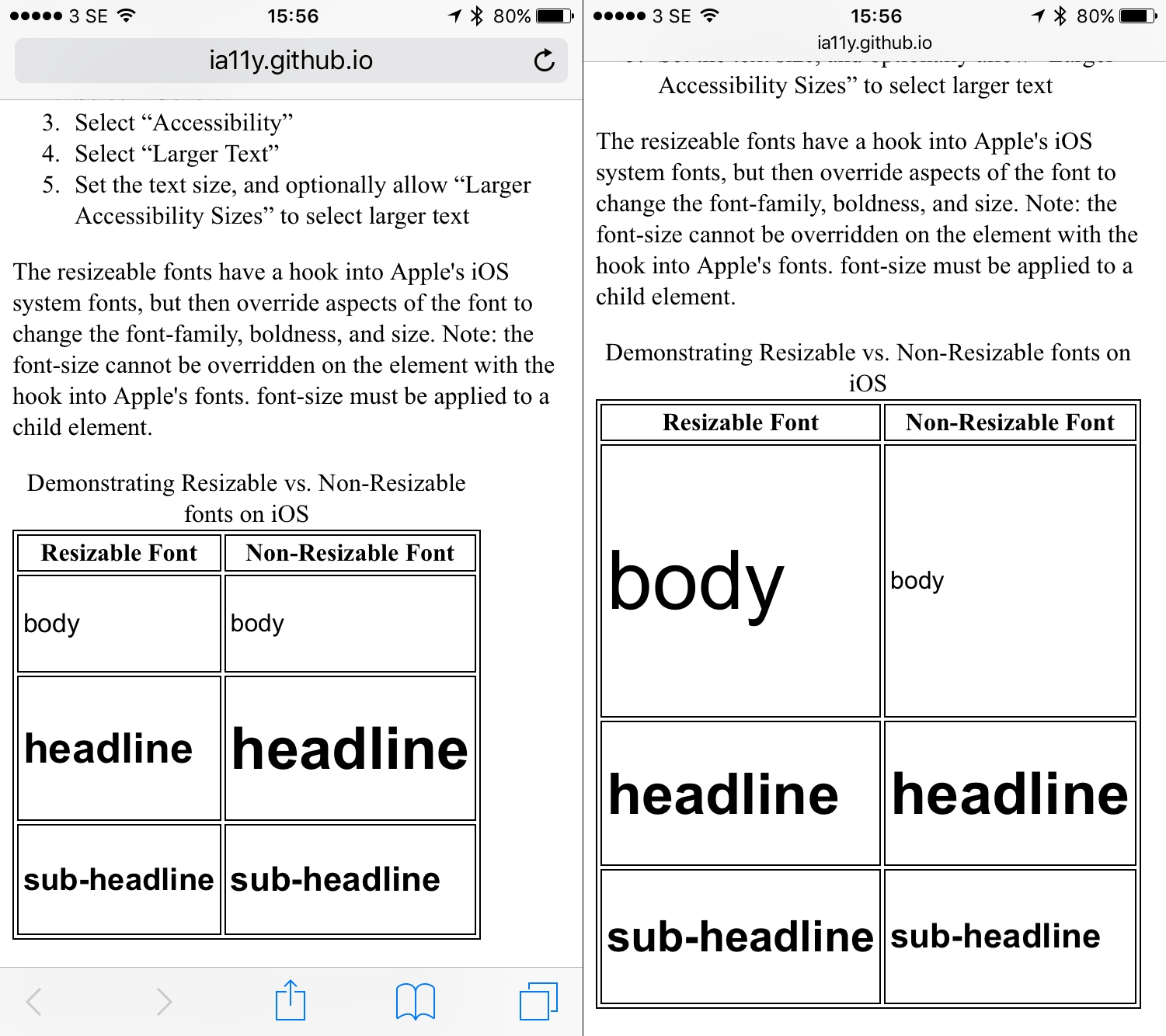
Left: standard text size. Right: with Larger Text (Dynamic Type) enabled. Notice that, by default, headlines are small and body text is big.
How you then add Dynamic Type depends on how you want to implement it on your site. For Better I wrote a list of what I wanted to implement:
- Dynamic Type should be applied to HTML root so all other font sizes scale relatively
- The use of Dynamic Type should not affect the page unless on iOS
- The use of Dynamic Type should not affect the page unless Dynamic Type is enabled
Setting Dynamic Type on the root
The example provided on the Interactive Accessibility site is to wrap a <span> around all the text you want to make resizable like below:
<p><span class="body-text-size">This is some text in my page.</span></p>This would be a complete nightmare to maintain, and near-impossible on a dynamically generated site like ours. If your CSS relies on setting a root font size, then using ems for all subseqent sizes, adding Dynamic Type is much easier.
First, you need to set the Dynamic Type font rule on the root. We decided that we wanted the font sizes and layout to scale up together, so I used -apple-system-body; as the root value:
html
{
  font: -apple-system-body;
}
Then all subsequent font sizes specified in ems with resize appropriately to the size chosen in the Accessibility settings.
html
{
  font: -apple-system-body;
}

h2
{
  font-size: 1.75em;
}
In the example above, the h2 font size is computed as 27.96500015258789px when the default font size is used, and 87.18499755859375px when the Dynamic Type size is set to the very largest using Larger Text.
Preventing the font rule from breaking the rest of the CSS
Adding the Dynamic Type in this way is pretty handy, however font: -apple-system-body; is not proprietary CSS, this is the correct syntax for using System Fonts. This means that all the other browsers will also see the font: property, use it to override any less specific font rules, but not understand the -apple-system-body value, and ignore it. Thus resetting the fonts back to its browser default. So I had to make sure other browsers wouldn’t see the font: -apple-system-body; CSS.
@supports to the rescue
Thanks to the wonders of modern browsers, Safari can detect support for font: -apple-system-body; using @supports. So I just needed to wrap any CSS related to Dynamic Type in an @supports at-rule, and I’m no longer breaking the CSS in other browsers:
/* ↓ root size for all other browsers */
html
{
  font-size: 14px;
}

/* ↓ root size for iOS browsers (those that support font: -apple-system-body;) */
@supports (font: -apple-system-body)
{
  html
  {
    font: -apple-system-body;
  }
}
If you were working on browser workarounds in the days of IE6 and IE for Mac, you will understand the level of delight I get from @supports.
When Dynamic Type is not enabled
Now that I had my Dynamic Type rule taking priority over the root size on iOS, I had another tricky issue: how do I set the root size when Dynamic Type is not enabled?
Technically-speaking, Dynamic Type is always enabled, it’s just a case of whether you have chosen to change the text size or not. This means that the root font size will always be Apple’s chosen default for -apple-system-body, even if you haven’t touched the Accessibility settings. If you’re the kind of person who always works from the browser’s default size, then this may not bother you. But I am a control freak, and I like font sizing to be fairly consistent cross-browser.
Inspecting the various computed font sizes, I found that Apple’s default font size is 17px, whereas my chosen root font size is 14px on the narrowest viewport. It’s a fairly sizeable difference. So I used the cascade to scale down the font size on the body element, so all the subsequent font sizes would be the same computed size as other browsers:
@supports (font: -apple-system-body)
{
  html
  {
    font: -apple-system-body;
  }

  body
  {
    font-size: 0.94em;
  }
}
This worked well, but I later on I was confused as to why my text wasn’t scaling up at different viewport sizes. (If you’ve read my post on how we scale using ems, you’ll know that I scale up the root font size at two wider viewport breakpoints.) This was because the specificity of the body rule was overriding that of the subsequent html rules. The media queries were not as specific in terms of the cascade. I had to re-state the body rule for each time I scaled up the font size according to viewport width. I also had to recalculate the adjustment for the default font size according to the desired font size. My final CSS for Dynamic Type and root sizes is now essentially:
html
{
  font-size: 14px;
  line-height: 1.5;
}

  @media only screen and (min-width: 28.78em)
  {
    html
    {
      font-size: 16px;
    }
  }

  @media only screen and (min-width: 33.4em)
  {
    html
    {
      font-size: 18px;
    }
  }

@supports (font: -apple-system-body)
{
  html
  {
    font: -apple-system-body;
  }

  /* default size of -apple-system-body here is 17px
   using that as a default, scale text down to equivalent of 14px (14/17).
  */
  body
  {
    font-size: 0.94em;
  }

  @media only screen and (min-width: 28.78em)
  {
    html
    {
      font: -apple-system-body;
    }

    /* default size of -apple-system-body here is 17px
     using that as a default, scale text down to equivalent of 16px (16/17).
    */
    body
      {
        font-size: 0.82em;
      }
    }
  }

  @media only screen and (min-width: 33.4em)
  {
    html
    {
      font: -apple-system-body;
    }

    /* default size of -apple-system-body here is 17px
     using that as a default, scale text down to equivalent of 18px (18/17)
    */
    body
    {
      font-size: 1.06em;
    }
  }
}
Now I think this is probably the most straight-forward way to implement Dynamic Type. Especially if you don’t need to scale up the root font size at different viewport sizes, and if you don’t mind using the browser’s default font size on the root. Has anyone else implemented Dynamic Type on the web? I’d love to hear how you did it!