Better Styles Through ems
29th November, 2016 —
CSS is vital to Better. The Better apps (iOS and Mac) are native apps that use web pages for their content. They’re the same pages you see on the Better site, but with specialised templates. Still, the content you see on the apps is largely HTML and CSS.
The pre-compiled architecture is fairly straight-forward:
- a common CSS file for styles that cover both the site and the apps
- a site CSS file that covers site-specific design elements such as the navigation, footer, and site homepage
- an app CSS file that covers rendering differences between the app(s) and site
Each of the CSS files is compiled into a global CSS file during the build process using first the common CSS file, and then either the app or site CSS files.
The opportunity
When we first launched Better, the iOS app had a coloured frame around the content (see below). The frame was in the native app, and meant the content viewport size was slightly different than when viewing the same content on the site in a web browser on the same device. It also meant the CSS required specific media queries to ensure more complex design elements, such as the statistics, would fit the viewport and still look good on narrow devices.
Left: the app with the coloured frame, right: the app without the coloured frame.
In September, Aral removed the coloured frame from the app interface. Firstly, this gave the interface a much cleaner and more spacious feel. It also meant the viewport widths were exactly the same whether you were looking at Better content in the app or in a web browser on the same device. This gave me the opportunity to overhaul the CSS, removing excess rules and repetition mostly caused by a gazillion media queries.
Changing the way I design for the web
In a yet-to-be-releasable redesign of my own site, I’d started experimenting with a new approach to units and measurements in my design and overall CSS. I started using ems for every unit. Using ems turned out to be easy, and made my CSS clean and simple, especially as I was writing the CSS from scratch. Using ems isn’t new or revelatory in the web world. But it was always an approach I shied away from before.
I’m pretty good at CSS. You don’t get away with being this bad at JavaScript without knowing CSS very well. Still, it’s taken me a long time to relinquish control over the pixel precision-based thinking learned through years of designing in bitmap graphic software. One can take the Photoshop away from the woman, but you can’t take the Photoshop mindset out of the woman. Even though I hadn’t designed in Photoshop in nearly a decade, had used vector graphic software, had jumped on responsive web design as soon as I heard about it, my brain still thought, and designed, in pixels. When I read anything new about responsive design and other development approaches, I used those techniques, but I still envisioned my work as pixels mapped in the canvas space. I used rems and media queries, but these were usually compiled from pixel units. I abstracted away my inflexible pixel brain.
To a flexible everything with ems
As Better no longer needed so many media queries, the leap from rems and px to ems was straight-forward. Though from a visual perspective, it was hard to visualise the units as relationships between the type and space without starting from scratch. In order to better visualise the design in flexible units, it turned into a complete refactor.
I started by converting all font-sizes to ems, then removing any subsequent media queries relating to those font sizes, instead using two media queries on the root:
html
{
	/* ↓ root size */
	font-size: 14px;
	line-height: 1.5;
}

	@media only screen and (min-width: 460px)
	{
		html
		{
			font-size: 16px;
		}
	}

	@media only screen and (min-width: 600px)
	{
		html
		{
			font-size: 18px;
		}
	}
This makes all font sizes scale up proportionally at 460px and 600px viewport widths.
With all font sizes scaling up from the root at 460px and 600px-wide viewports, every other rule using ems will scale up too. Thanks to the cascade, the scaling is always in proportion to the font size. This makes most media queries redundant, with exceptions only when tweakpoints are required between or above these viewport sizes. Scaling with ems requires fewer rules, and makes every rule proportional. It’s building on the existing flexibility of the web.
Then I took all the paddings, margins, max-widths, and anything else related to space or layout, and converted those units to ems, removing their media queries too. I generally used the old target/context = result rule. A margin: 12px;, with a root font-size of 14px becomes margin: 0.857142857em;. The decimals are ugly, and harder to visualise, so I rounded units as I re-factored. This makes the margin: 0.857142857em; a much tidier margin: 0.85em;.
With barely any media queries, the CSS was easier to manage. It meant I could have a fresh look at the relationships between the type and the space, adjusting consistently across all the elements. When writing CSS, I first style based on the naked elements (h1, h2… ul… p etc) themselves. (Heydon recently wrote a great article on the benefits of this approach.) Styling without classes is also necessary as most of our content is generated directly from markdown.
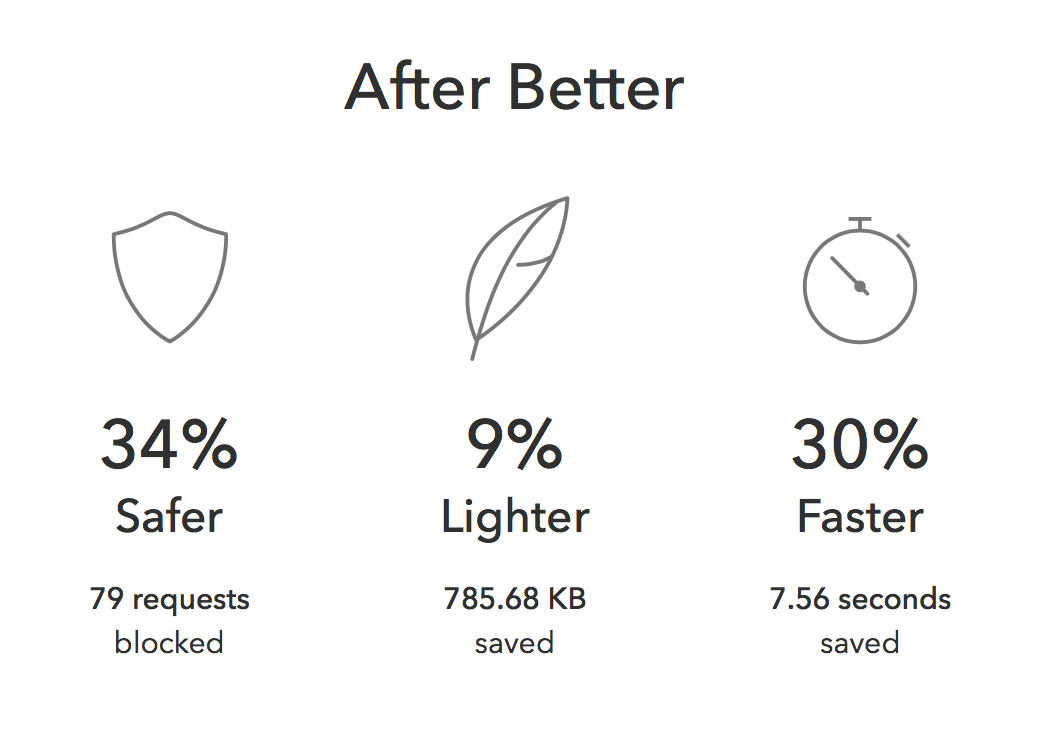
The few modules that rely on classes for more complex layouts and styles (such as the statistics below) didn’t need a million breakpoints either. The core typography and spacing of these modules were already adjusting to the available space derived from the base element CSS, so when refactoring, the rules only occasionally needed minor tweakpoints.
Once the rest of the layouts were relying on em units, I could make any icons (which are SVG background images) use ems for their sizing too. Using ems for SVG icons make perfect sense, as they’re vector anyway, and means they can then scale to the text around them.
The Spotlight page has its own CSS applied on top of the global styles, as it has a custom design for each issue. In refactoring to use ems, I again removed a load of CSS (100 lines exactly) that wasn’t necessary now the base elements were more flexible. Cascade FTW.
A bit of vw
In the spirit of refactor, I went all-out. On the current Spotlight page, we have a big “Bait!” headline, filling the width of the main container. It was a perfect opportunity to replace a load of media queries with vw units for the font-size. The only additional CSS needed was a media query to ensure it doesn't exceed the width of the container when the viewport is wider than the container.
body.spotlight h1.headline
{
	/* ↓ fallback */
	font-size: 8em;
	font-size: 36vw;
	line-height: 1;
}

@media only screen and (min-width: 600px)
{
	body.spotlight h1.headline
	{
		font-size: 13.2em;
	}
}
Better SVGs
Getting all overexcited with stripping out unnecessary CSS, I decided to do the same with our graphics too. Last month I read Chris Coyier’s Practical SVG which helped me understand the ins-and-outs of SVG much better. To help grok as I was learning, I created a little find-and-replace script to scrub all the junk out of a generated SVG file to keep it nice and small. One of Chris’ simplest tips was removing excess decimals from the path points. This alone can halve the size of an SVG.
<?xml version="1.0" encoding="UTF-8"?>
<svg width="25px" height="28px" viewBox="0 0 25 28" version="1.1" xmlns="http://www.w3.org/2000/svg" xmlns:xlink="http://www.w3.org/1999/xlink">
	<!-- Generator: Sketch 41.1 (35376) - http://www.bohemiancoding.com/sketch -->
	<title>resources-small</title>
	<desc>Created with Sketch.</desc>
	<defs></defs>
	<g id="Icons-and-Clouds" stroke="none" stroke-width="1" fill="none" fill-rule="evenodd">
		<g id="table" transform="translate(0.000000, -93.000000)" stroke="#787878">
			<g id="note" transform="translate(4.000000, 99.000000)">
				<polygon id="paper" stroke-linecap="round" stroke-linejoin="round" points="0.5 0.5 11.5622559 0.5 16.5 5.49975586 16.5 20.5 0.5 20.5"></polygon>
				<polyline id="corner" points="11.5 0.5 11.5 5.50014165 16.5 5.5"></polyline>
			</g>
		</g>
	</g>
</svg>
SVG icon generated by Sketch (which is pretty clean anyway,) 903 characters
<svg width="25px" height="28px" viewBox="0 0 25 28" xmlns="http://www.w3.org/2000/svg">
	<defs></defs>
	<g stroke="none" stroke-width="1" fill="none" fill-rule="evenodd">
		<g class="table" transform="translate(0.00, -93.00)" stroke="#787878">
			<g class="note" transform="translate(4.00, 99.00)">
				<polygon class="paper" stroke-linecap="round" stroke-linejoin="round" points="0.5 0.5 11.56 0.5 16.5 5.49 16.5 20.5 0.5 20.5"></polygon>
				<polyline class="corner" points="11.5 0.5 11.5 5.50 16.5 5.5"></polyline>
			</g>
		</g>
	</g>
</svg>
SVG after my script, 634 characters
Cross-platform reliability
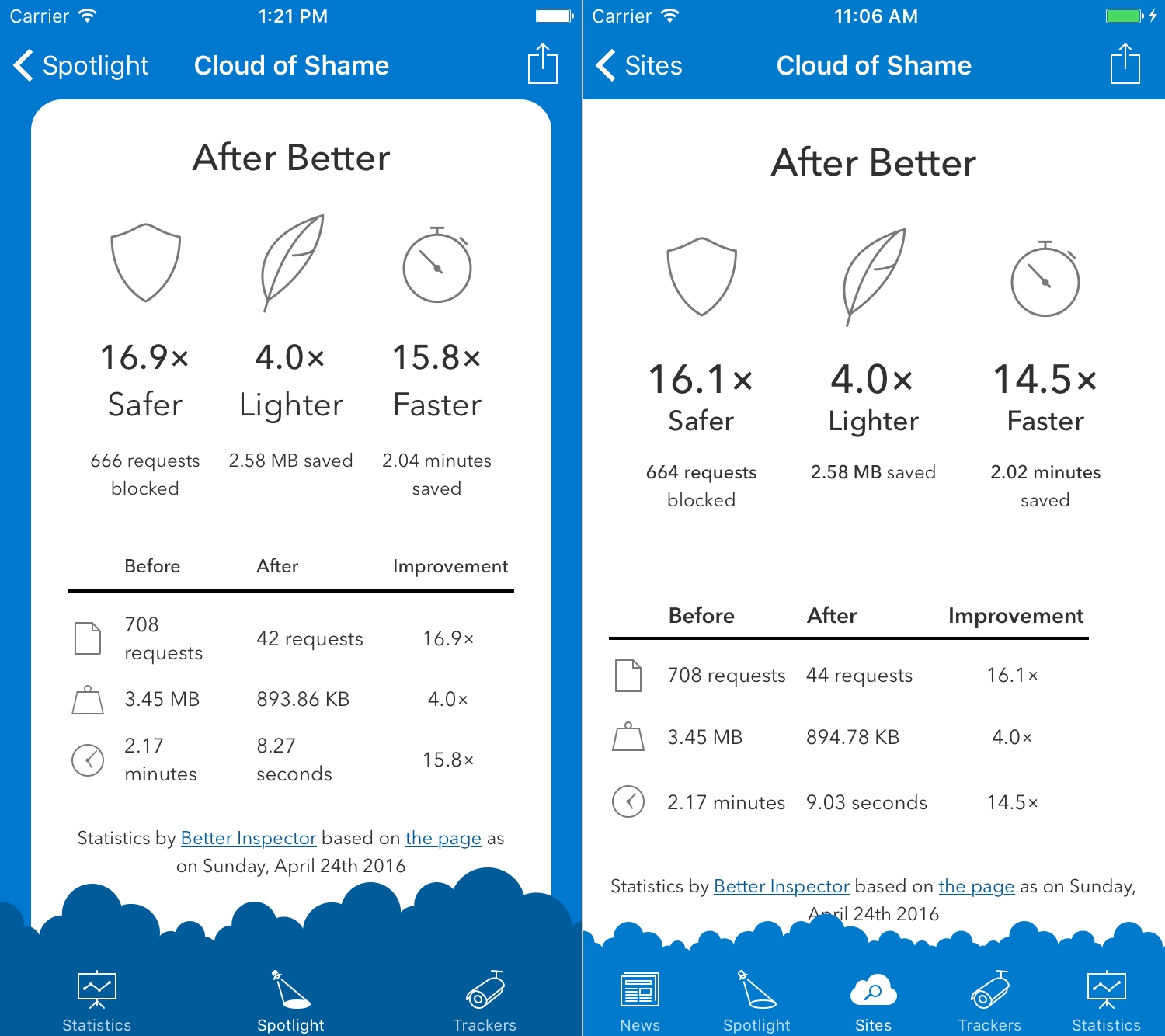
If you compare the old layout to the new layout, the most noticeable change is how the content better fills the available space than before. It’s particularly noticeable inside the app. Before, the layout looked like a website inside an app. Now, it looks like the content is a more unified part of the whole.
Before the overhaul—on iPad Air 2
After the overhaul—on iPad Air 2
In development terms, this refactor has a big performance advantage. The compiled CSS on the app has gone from 19kb to 16kb. The compiled CSS on the site has gone from 34kb to 25kb. Comparing Better to a site laden with JavaScript trackers, performance was never an issue to begin with. Where we really win is in maintainability, now the CSS is much simpler and easier to read.
This refactor was bigger than planned, but we still have plenty more changes on the roadmap. One of our core principles at Ind.ie is to iterate, rather than work on big upfront design. With this approach we hope to keep making everything we do incrementally better.